House of Color
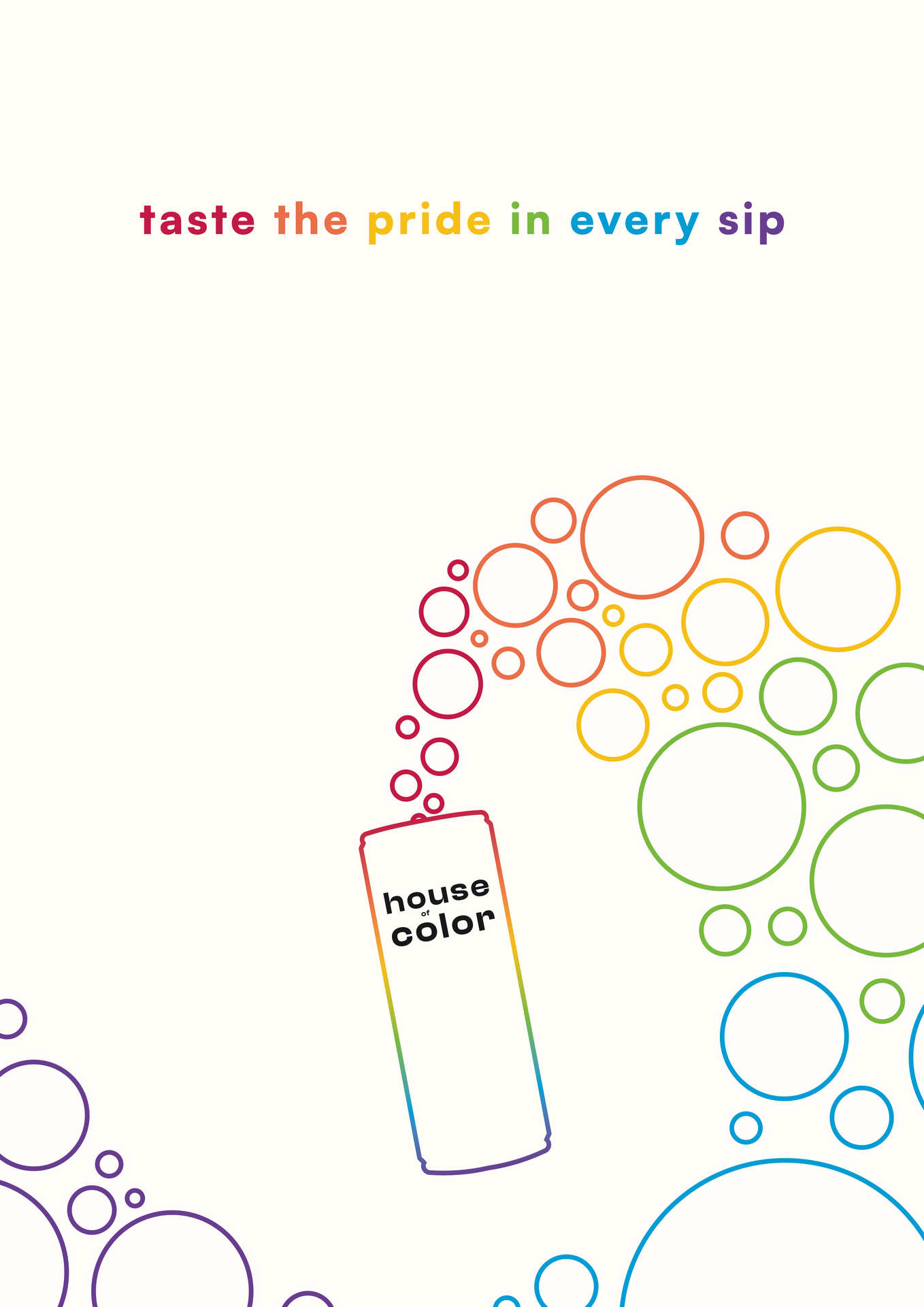
A fictional pride-focused soda brand with a brand book, soda can design and promotional poster.
- Context
- Individual student project
- My role
- Brand concept, visual identity, packaging and poster design
- Output
- Brand book, six flavour designs and campaign poster
The challenge
I developed a premium sparkling soda brand around the core value of pride. The identity needed to express individuality and belonging while maintaining a minimal, recognisable appearance.
Turning pride into an identity
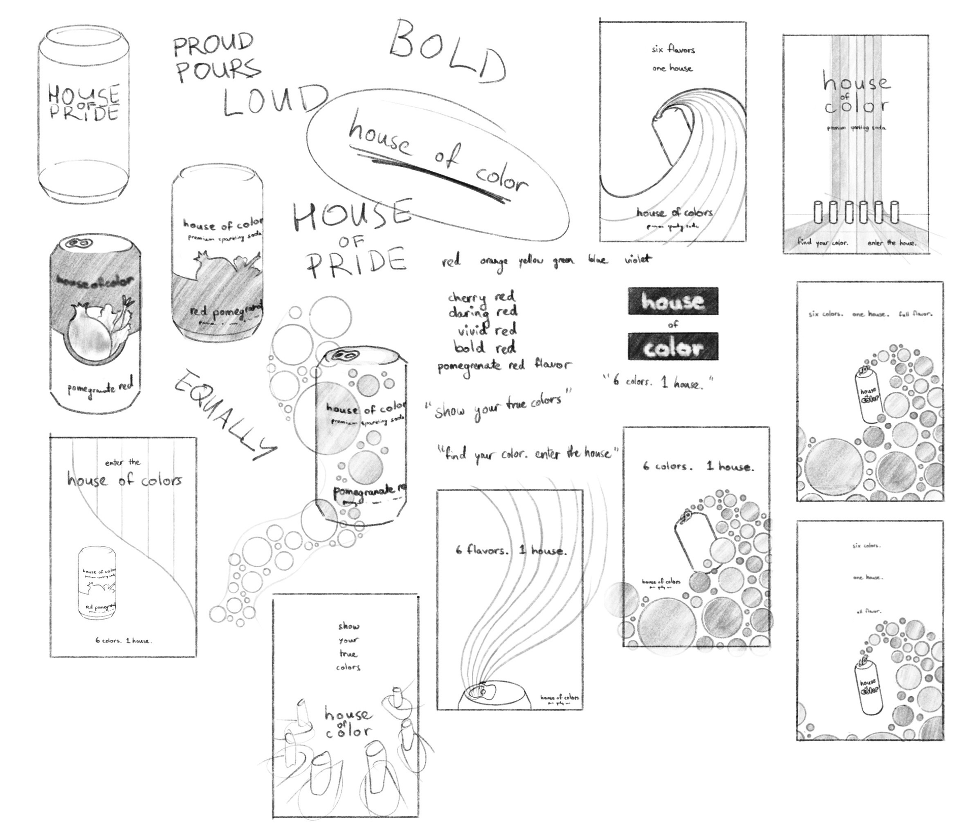
The name draws on ballroom culture, where a house can represent chosen family. I explored rainbow-based designs before developing a circle motif that connects pride colours with the bubbles of a sparkling drink.
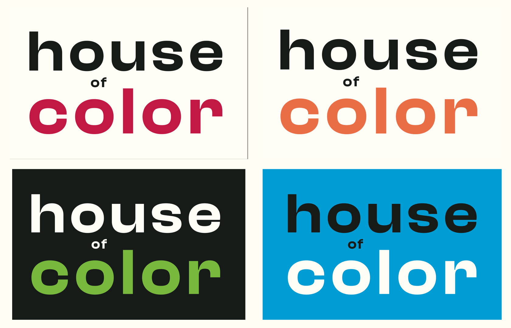
Clash Display and Satoshi support the brand’s typography, while lowercase lettering gives the identity a more approachable tone.
One identity across six flavours
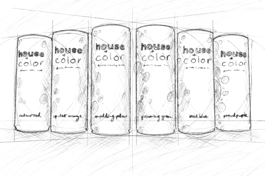
Each rainbow colour became a flavour with its own name and colour. A shared off-white base, consistent typography and holographic details connect the cans as one collection. The design continues around each can, including the product information on the back.
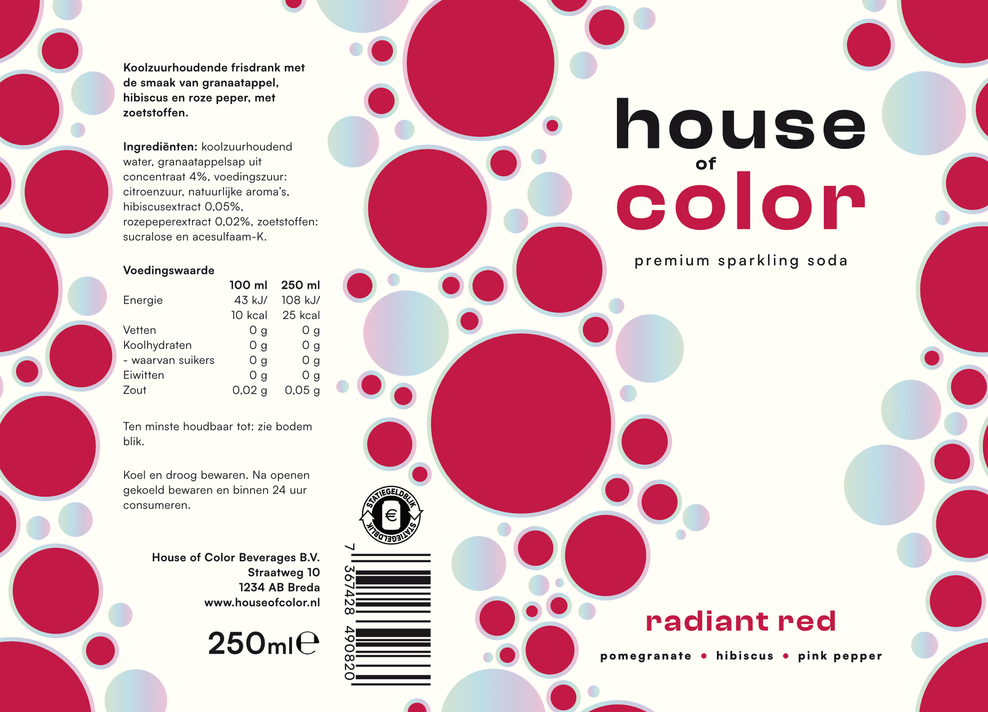
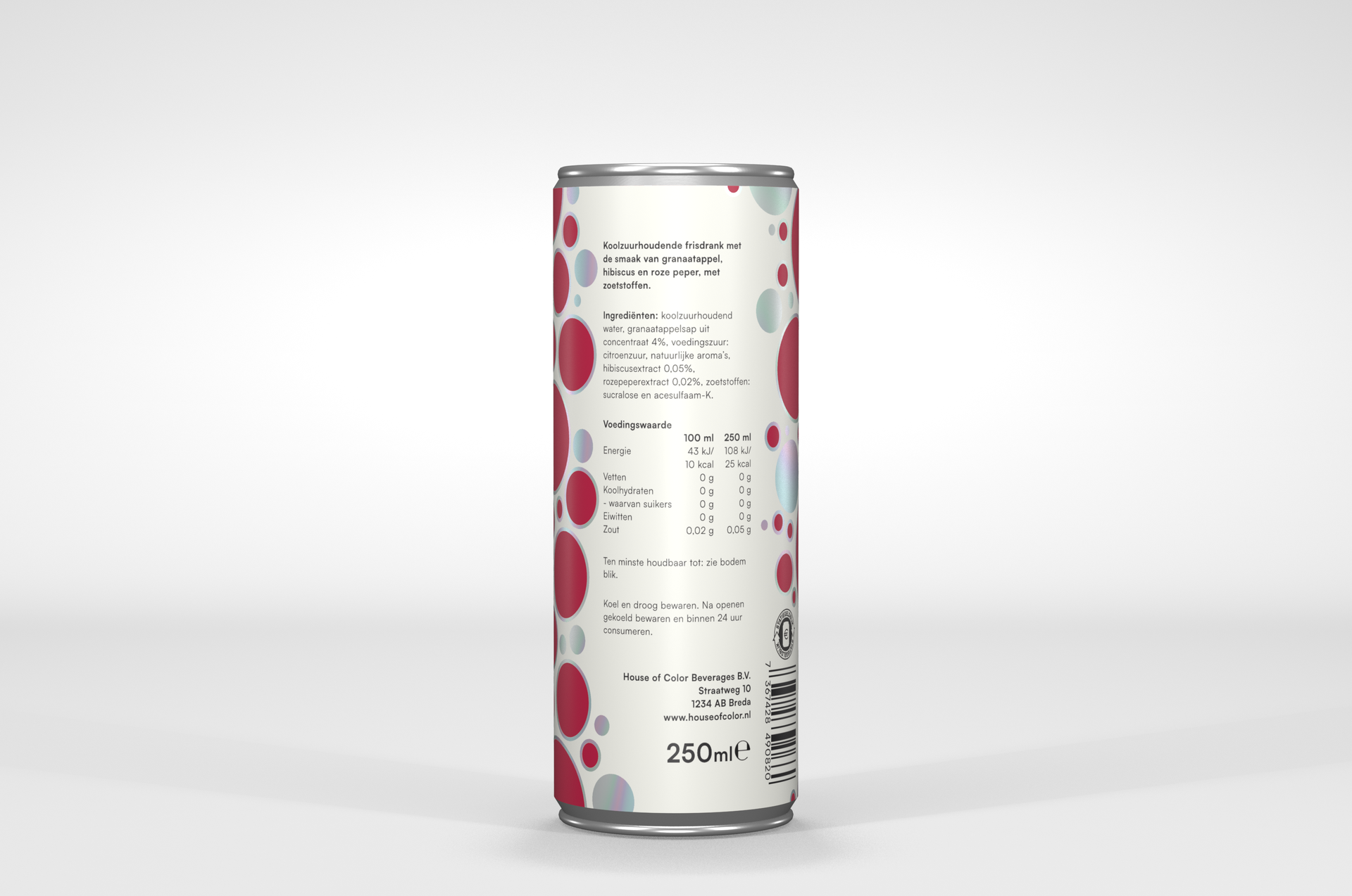
The outcome
The final identity brings together a six-flavour collection, packaging mockups and a promotional poster. The slogan “taste the pride in every sip” connects the drink to the brand’s central idea.